Switching the Narrative
Scope
Product Design
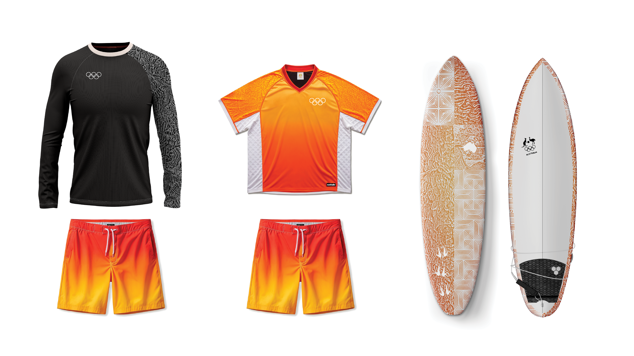
Switching the Narrative is an Australian surf kit inspired by the raw orange tones and natural rock formations of the Outback. Inspired by the land itself, the patterns and color ways draw directly from the region’s iconic landmarks.
Role
Sole Designer


Breaking the Landscapes
The rock formations became the foundation of the design, their organic grooves first captured through landscape photography and then utilized with a collage treatment. The pattern and application serve as a nod to the distinct visual layers carved into the stone over time.